Cyan Advisories
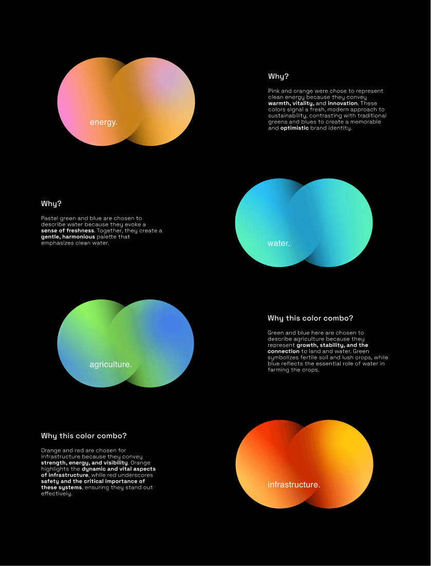
Created a landing page for Cyan Advisories, a B2B company, with the goal of showcasing their expertise across multiple sectors. The challenge was to highlight their versatility and continuous growth while maintaining a cohesive and professional brand identity. To visually represent this diversity, gradients and abstracts were proposed, which blend colors and intersections between to various industries, reflecting their broad range of services. The design maintains a modern, clean aesthetic with clear calls-to-action to drive lead generation. It’s also optimized for responsiveness, ensuring a seamless experience across all devices.
Client
Cyan Advisories (India)
Role
UI Designer/Developer
Time
3 week
Year
2024
Project type
UI Design / Framer Development

Special Thanks to Drishti Desai, for helping me with the design direction.
Brief
To create a professional & visually appealing landing page for a B2B business that represents the client’s expertise across multiple sectors, highlighting their ability to cater to a diverse range of industries while maintaining a cohesive brand identity.
Goals
Through the website bring in state-of-the-art technologies in our key sectors and represent them in a systematic and experimental way. Also, bring in the idea of a brighter and optimistic future within the four sectors — clean water, clean energy, agriculture, infrastructure.
Target Audience: Business decision-makers, potential partners, and stakeholders across various industries that the client serves.
Color Palette
For Cyan Advisories, I chose to work with gradients because of the melange of the sectors they are helping with. To emphasized I used the palette with yellow, orange, and blue to reflect the brand’s core values of creating opportunities and enabling partnerships.
Yellow: Optimism and forward-thinking
Orange: Adds warmth and approachability.
Blue: Conveys trust and stability.
Green: For accents, conveys sustenance
Together, these colors create a dynamic, engaging identity that fosters collaboration and growth.
Font Selection
PP Sans Pangram: Offers a clean, contemporary feel, which adds a sleek, approachable touch, aligning with Cyan Advisories’ grounded yet forward-thinking ethos.
Space Grotesk: Brings a geometric, structured look, ensuring readability and a sense of precision, reinforcing trust and credibility.
Together, they create a visually engaging yet reliable and professional aesthetic, ideal for Cyan Advisories.
Takeaways
Clear Messaging: Crafting a direct and compelling value proposition via the landing page.
Abstract Shapes: Utilizing abstract shapes to add visual interest and reinforce the brand’s identity and message.
Visual Hierarchy: Making content easy to scan and digest for the audiences.
Analytics: Using numbers to summarize the content.
Brand Consistency: Keeping your brand’s look and feel cohesive.
Responsive Design: Ensuring the page looks great on any device.
Engaging Content: Connecting with your audience through relevant content.